NEWSPAPER DESIGN
Makeup and Layout
Makeup – arrangement of the display elements on a printed page, including headlines, body texts, illustrations, photos, white spaces and column lines. It also refers to the page design of a newspaper while layout refers to that of a magazine or an advertisement.
Three functions of a newspaper makeup:
- To provide attractive appearance to the individual pages and a pleasing harmony or contrast in the continuity of pages.
- To show the relative importance of news and feature materials through their positioning in the pages.
- To facilitate reading through the avoidance of monotony or disharmony in the appearance of newspaper pages.
Qualities of a good make-up:
 |
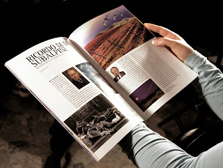
| A good design of a magazine. |
- Contrast - A black headline next to the column of gray body type creates a pleasing contrast. Two or three subheads or quotations from the story can brighten a wide expanse of gray body text. A picture can also provide contrast in a page.
- Balance - This is achieved by arranging heavy or dark elements to offset one another. For example, a three column picture on the upper left can be balanced by a three--decked, three--column head on the right.
- Symmetry - Each space should have a focus of attention - a headline, a picture, or a combination of both to ensure that the readers’ eyes fall first on that spot.
- Unity - The page should be attractive as a whole, with all its parts fitting harmoniously together.
Makeup Patterns:
Forms of designs for the paper:
- Balance Makeup - A balanced page suggests orderliness, precision of thought and unity. Like elements (same types and sizes) are placed opposite each other with some intervening white spaces or pictures in between.
- Brace Makeup - The display elements make a pattern slanting downward from left to right across the page, like the brace of a shelf. This kind of design usually has large display of one very important story.
- Modular Makeup - The front page is divided into four segments or modules with each one having its own focus of attention. If the page of a newspaper is divided into a number of modules like a checkerboard, it is called the grid system. This is usually used in a magazine layout.
NAMEPLATE OR LOGO
The nameplate or logo of a newspaper is printed across the top of the front page. This is used as an element of display design.
General practices followed in printing the nameplate:
- The nameplate is smaller in width than the width of the newspaper page and remains the same in size and appearance.
- Placement of a story at the level above the nameplate means that the story is an important one.
- One or more headlines should fill the top of the columns beneath the nameplate, thus providing a solid base on which the nameplate may rest.
BREAKERS TO MAKE THE PAGE ATTRACTIVE
Boxed Story
A boxed story is usually a very important story or one with human interest. The box is also used to break up an expanse of gray body type or to provide a divider between two regular headlines. A boxed story should not be placed beside or adjacent a picture because its effectiveness will be weakened.
Subhead
A subhead is a single line of the same type as the body set in bold or italics that gives a gist of a part of the story that follows. It should contain a noun and a verb. Its purpose is to break a series of gray lines.
Direct Quote
A direct quote from the source of the story.
PRINCIPLES IN NEWSPAPER DESIGN
In order to make the newspaper layout attractive here are some principles to follow:
- Layout and blacker headlines and pictures should be displayed at the top of the page. Headlines below should be lighter and smaller.
- Harmony should prevail in the selection of types for headlines.
- Avoid “tombstoming” of headlines. Two headlines of the same types should not be placed side by side.
- The headline in one column should not be at the same level as any part of a headline in an adjacent column.
- Wide or unbroken space of gray body text should have subhead or quotation breakers.
No comments:
Post a Comment